I want now to pursue further the question of which is earlier, the "early" woodcut pattern or the "late" engraved or engraved-inspired version.
First, here are my online sources for the two types. Among the engraved series, even though there were two sub-patterns, one after 1820 and the other from at least a century earlier, we can ignore the post-1820 because it is obviously later. Before then, at least until 1806-8, the only difference is that some are complete and some not, and some hand-colored and some left uncolored. For my examples I will mostly use the uncolored British Museum's Schreiber 47, because it is considered the earliest (see my previous post). It is at
https://www.britishmuseum.org/collectio ... 96-0501-34. Otherwise, I gave a list of all I could find, except the Meneghello and Lo Scarabeo (for both of which see
http://a.trionfi.eu/WWPCM/decks07/d05115/d05115.htm), at
viewtopic.php?p=26484#p26484.
Among the woodcuts, there is a difference between Bologna and Florence, mostly in small details and more in the suits than in the trumps, but it is good to look at representative samples of each. At
viewtopic.php?p=26481#p26481, I gave a separate list for each, mostly from the websites of the British Museum, the Bibliotheque Nationale de France, and trionfi.com. For present purposes, one of each is enough. For Bologna, Peter Endebrock conveniently shows all 97 on one web-page at
http://www.endebrock.de/coll/pages/i31.html. For Florence, the British Museum's Schreiber 53 is a good bet, because it is complete. But it is not very pretty, so I will be supplementing it. It is at
https://www.britishmuseum.org/collectio ... 96-0501-41, from links at the generic pages for the minchiates at the British Museum and Gallica (BnF):
https://www.britishmuseum.org/collectio ... asc&page=1 and
https://gallica.bnf.fr/html/und/images/ ... de=desktop.
Finally, there is a proof sheet of the earliest woodcut version known, held by the German Playing Card Museum, pictured on p. 60 of Thierry Depaulis's 1984
Tarot: Jeu et Magie exhibition catalog, viewable at
https://archive.org/details/bnf-bpt6k65 ... 7/mode/2up, or
https://gallica.bnf.fr/ark:/12148/bpt6k ... n/f66.item. It is mostly suit cards; only two trumps are there, trumps I and II. It is without doubt of the Florentine variety. I have discussed the differences between Florence and Milan’s woodcut series at
viewtopic.php?p=26481#p26481 (the same as cited two paragraphs ago) and the post following.
So to begin. It seems to me that we have to ask, what would the inventor of the engraved (or "late") version have changed from, if his was earlier than the so-called "early" pattern? That is, it is not a question of artistic style, but of what it was he was redoing in his special way, perhaps drawing on other sources. The same question could be asked of the woodcut images. This means ignoring the subtle differences that could be based on the same sources.
So, for the Fool, the difference between the engraved and woodcut images is that the engraved has feathers and a pinwheel, while the woodcut lacks both and has instead the traditional foolscap; both have two children around them and a ball on a string.
So did the engraver add the feathers and pinwheel, or did the woodcutter subtract those items? Feathers are associated with folly already in Giotto’s “virtues and vices” in Padua (
https://commons.wikimedia.org/wiki/File ... shness.JPG) and the Visconti-Sforza Fool (
https://www.themorgan.org/collection/ta ... s/the-fool), but for the pinwheel the earliest I can find in a readily accessible source is the illustration of Psalm 52 in a Bible of 1490, Bodleian Library Douce 244. Children are in both the BnF’s “Charles VI” (
https://gallica.bnf.fr/ark:/12148/btv1b ... arles%20vi, above) and the d’Este (
https://collections.library.yale.edu/catalog/2003006). Since both versions of minchiate are first known almost two centuries later, I can’t say which came first in minchiate. But the one without the pinwheel seems slightly more archaic, because pinwheels, based on my evidence so far, do not go back as far as tarocchi Fools.
The two versions of Papa Uno differ in that the performer in the woodcut faces the viewer with children behind on either side, while the woodcut faces the right side, looking at children at that side of the table. Side views as well as frontal ones existed a couple of centuries earlier than the minchiate examples - the Cary Sheet (without onlookers, far right below), the late 15th century Florentine “children of the planets” illustrations (adults) for Luna (my image is from Hind,
Early Italian Engravings, Plate 127, and the Castelin Geoffoy, 1557 (far left in second row). But the frontal view and lack of onlookers is more archaic. Also, in this case it looks very much as though that the minchiate image (from Florence, third from left in second row, Schreiber 53) is midway, in its features, between the Rosenwald (second from left, from
https://www.nga.gov/collection/art-obje ... 41321.html) and the earliest Bologna card (1690s "Alla Torre," on Gallica). So probably the woodcut is earlier. That argument will not work for the Fool, because the Rosenwald Fool is not on the sheet Bologna Fool is something totally different, a drummer.
Then there is the Wheel. Where the engravings have a Fortuna with flying hair where the woodcudts have a man going down the wheel. The hair, was connected with the the saying “Seize Opportunity by the forelock.” In the 15th century, an illustration sometimes attributed to Mantegna showed Wisdom restraining a youth from grabbing her. A more readily available example is in the 1531 edition of Alciato’s
Emblemata, under “In Occasionem” (
https://www.emblems.arts.gla.ac.uk/alci ... id=A31a017). The 1591 edition has her standing on a wheel:
https://www.emblems.arts.gla.ac.uk/alci ... id=A91a121.
Several early tarocchi Wheels have donkeys (Budapest 5044, uncut sheet and copies, at
http://cards.old.no/irwpc/t2/, and below), or donkey ears (Brera-Brambilla, easy to find on Web; Visconti-Sforza,
https://www.metmuseum.org/art/collection/search/697870). And the Bologna ca. 1500 card, part of the sheet now in the Ecole de Beaux Arts, Paris (far right), has the posture and things in the hands; the club of course replaces the usual scepter. Here I think the woodcuts have the edge on priority, because most of the associations come from earlier tarocchi, but not the lady with wind-blown hair.
For the World card, the engraving shows a map with the word “Europa” in the center, while the woodcuts have just a building or two, in Bologna’s productions invariably churches, but in Florence perhaps a Greco-Roman temple (third from left). It was towers among hills that dominated previous World cards, not maps, although perhaps the Visconti di Modrone offered a map of sorts, in that it was a kind of schematic picture of Lombardy (far right). A minchiate of Lucca at the British Museum (fourth from left) seems to show a tower on a hill. (The feminine angel is often seen in Florence, too, but not Bologna.) Exchanging her spear for a trumpet (a very different message!), adding some clothes as on the “Charles VI” (fifth from left) and showing just part of her, she could be the lady on the Modrone (detail below the others).
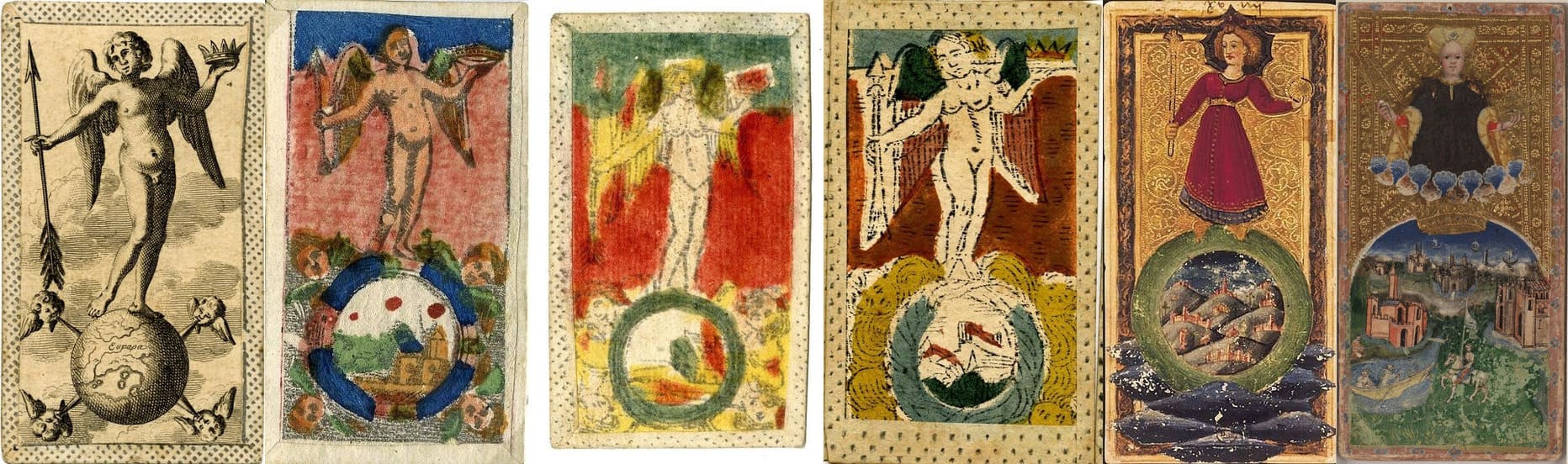
As for the change from buildings to the map, I think social factors should be considered. The early cards mostly just had the architectural features of northern Italy. A map with Europe in the center speaks of a vaster world, a continent and more, one opened up by the “voyages of discovery.” With an angel on top offering a crown to some and an arrow to others, there is also a sense of the mission of Europe to spread the message of salvation to the benighted rest of the world, so as to secure the crown of victory for Christianity everywhere, as Phaeded pointed out in another thread. So the engraved World card seems later than the woodcut
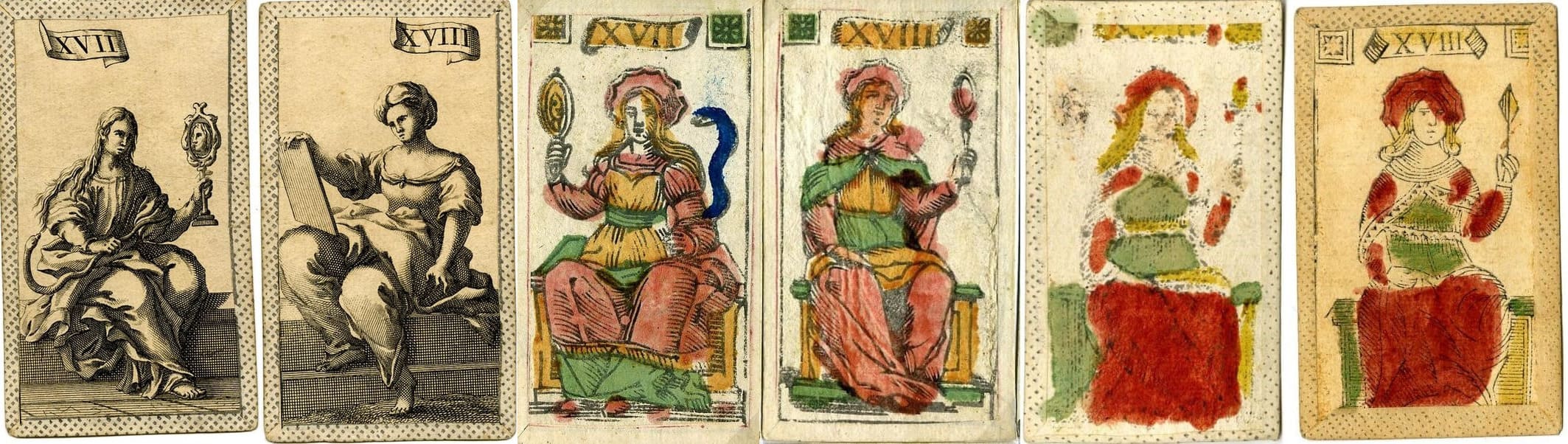
One other thing stands out: in the woodcuts, the three tarocchi virtues Temperance, Strength, and Justice, have crowns; the engraved have nothing special around their heads. The same is true of the engraveds' theological virtues and Prudence, which in the woodcuts have octagonal halos (see Prudence and Faith below). The tarocchi's three virtues had octagonal halos in the “Charles VI,” Rosenwald, and d'Este tarocchi, and the Florentine illustrations of Petrarch’s
Triumph of Fame., among other subjects there. They soon fell into disuse, and only the halos remained, exclusively for holy personages. That again favors the woodcuts, even if only the theological virtues got the old octagonal variety, and the three tarocchi virtues had to settle for crowns. The lack of distinguished headgear in the engraved is shared by Mitelli's tarocchini as well as the ordinary tarocchini of his time, although for how much further back is unknown.
Faith among the theological virtues requires special attention for another thing: in the woodcuts she holds something in her left hand that could easily be mistaken for Prudence's mirror (below, she is far left and third from left below; third and fourth are of course Endebrock). I can understand why someone would change the object to a tablet, so as to distinguish the card clearly from the one before; it also offers a clear allegory relating to the Ten Commandments. I am not sure that the makers of the woodcuts in Florence even recognized the mirror-like object. Perhaps that is why they present the object more indistinctly and sometimes even give it a diamond shape fifth and sixth from left (Schreiber 53 and 56): that would distinguish the card from the one before, along with the hand she is using, in the woodcuts their left). I cannot understand why anyone would change the tablet to something so like what is on the preceding card, but it easy enough to understand the reverse, whether to the tablet or something else unlike a mirror.
The allegory is also unclear with the mirror-like object: what does it have to do with Faith? It bears some resemblance to a monstrance – a thin mounted glass cylinder holding a consecrated communion wafer – without clearly being one, as they usually had a cross on top and often golden rays as though emanating from what was inside. A monstrance is close to the way Faith was represented in the Visconti di Modrone, which has a communion cup, holder of the blood of Christ. In the Middle Ages, Faith was sometimes portrayed as holding a chalice or a baptismal font. The wafer similarly is the body of Christ ((Katzenellenbogen,
Allegories of Virtue and Vice; font, pp. 45 n 2, 48, 56; "receiving the host", 53 n. 1 ). Perhaps the card makers were afraid of being accused of sacrilege. The red dots stenciled on one of the woodcuts might be an attempt to suggest a cross-staff, another attribute of Faith , seen on the Visconti di Modrone's Faith card (detail below).
The table of the law, being Jewish, is for a Christian less sacred than a monstrance. It is also more ecumenical - all versions of Christianity supported the Ten Commandments, only some held to the doctrine of transubstantiation. That may indicate a time when the battle lines between orthodoxy and heresy were already drawn, as opposed to when the lines were still being fought over. For any of these reasons, the woodcuts' depictions are probably earlier than the engraveds’ for this particular card.
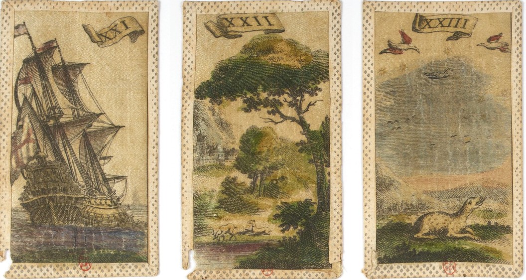
Moving on to the four elements, there are differences in three of them, even if each draws on commonly made associations: landscape and buildings for earth, a ship on the sea for water, and birds and the sky for air. Wikipedia has a nice entry on "the classical elements" that gives several ways the elements were standardly imagined. These are perennial associations. However, the depictions of the two ships differ in that one looks considerably larger and more elaborate than the other. Ships did get significantly larger between the time of Columbus and the 17th century, owing to the needs of warfare and of traveling long distances on the open sea. So this is another instance where priority goes to the woodcuts.
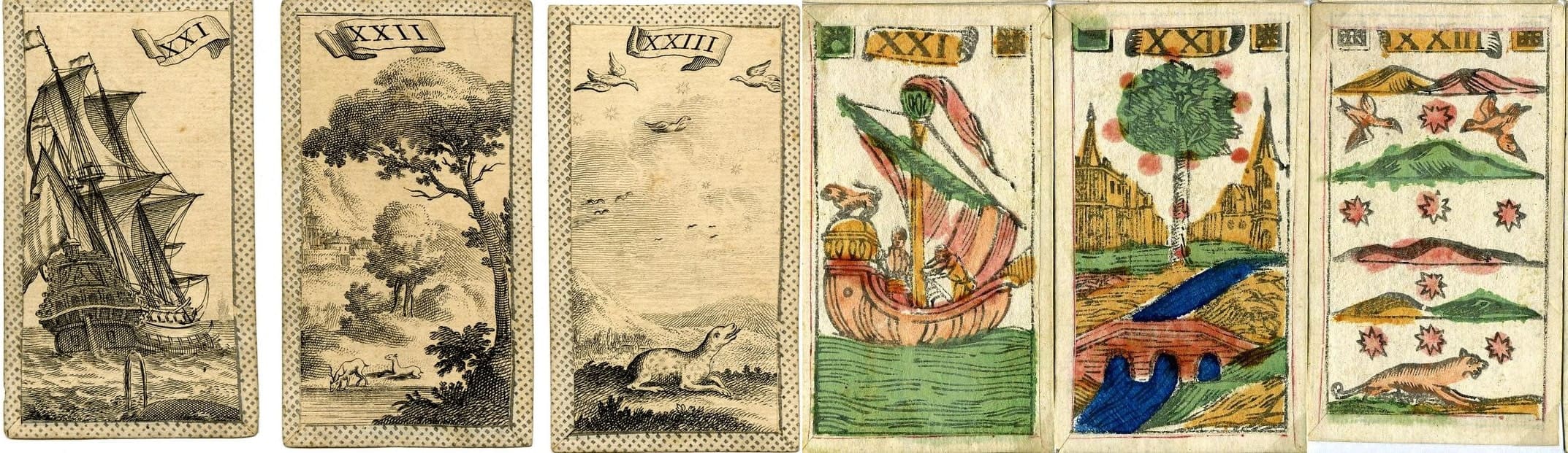
There is also a matter of clarity and naturalness. The counter-reformation Church wanted messages to be clear and unambiguous. The words of church music were meant to be readily understood by the laity, and so was its art. Also, conventional symbolism was rapidly being replaced, or at least supplemented, by the sheer appreciation of nature and life. So a schematic representation of seven stars and layers of clouds would suggest "sky" rather than "air," and it makes sense that its schematic, unrealistic composition would give way to showing air as it really was, in between earth and sky, and stars as they really were, not in an orderly fashion but scattered here and there. If there is a row of stars, it is one that reminds us of Orion's belt. Moreover, the depiction of "earth" with flowing water in the center suggests water as much as earth; if it were not for the card with the ship, one wonder which it was. (The green water is absolutely typical. When I look at some Florentine decks, I see no blue at all: perhaps green was cheaper.) The landscape in nature is more to later taste than the exhibition of humans and their works, bridges and great buildings, or mythical creatures, in which the landscape is merely the setting. Since in being more naturalistic, color matters, I show also the earliest engraved version with color, the 1712-1722 on Gallica, although we don’t actually know when the color was added. All three of the engraved depictions of the elements seem later than the woodcuts' versions.
Then there are the signs of the zodiac. The woodcuts give two jugs for Aquarius, the engravings just one. Two jugs is one Renaissance way of representing Aquarius, seen in various books of hours and zodiacs. Sandyh posted a lot, both one jug and two, at
viewtopic.php?p=20527#p20527. Below are from a Book of Hours at the Morgan and a 1496 zodiac of Troyes, France. Then one jug became standard. In the early tarocchi, there’s the ca. 1500 Cary Sheet Star card (from the Beinecke Library website), with two jugs and the tails of the two fish of Pisces in the water.
Taurus, between woodcuts and engravings, is also portrayed two ways; the woodcuts give the front half of the bull, propped up vertically on the ground its forelegs in the air, whereas the engravings (far left below) have a whole bull with all four feet on the ground. This is again a case of going for naturalism. The half-bull image was quite common. An example is in the 1496 zodiac, and also an illustrated Hyginus’
Poeticon Astrononicon of 1475 and 1482 Venice, at
https://www.vagabond-des-etoiles.com/ar ... con-hygin/, both seen below. It continued in Bayle’s highly valued 1603 astronomical treatise, with the half-bull image that corresponded to the stars of that constellation.
For Gemini, Sandyh found Medieval and Renaissance examples of great variety at the link I just gave (and see also
viewtopic.php?p=20599#p20599), all compatible with the various woodcut poses, of which the Endebrock (far right above) is one. Typically the non-minchiate examples in that era are a male and a female, although two males is not unusual. What is not found in the sources is an example where the pair are both clearly female, which is what we see in the “late” pattern minchiate (second from right above). That alternative can only have arisen from looking at early examples where the sex of at least one of the two is not clearly evident. Hence the engraved version again is later than the woodcut.
There are differences in the suits as well, but here the matter is more complex, because they were shared with regular decks, varying from region to region with a history of their own. Also, the woodcut versions vary more between Bologna and Florence, as well as both from the engraved version. I think enough has been said to show that the “early” woodcut versions are indeed earlier than the “late” engraved, at least as far as their distinctive trumps are concerned.