Thanks for the further elaborations on Francesco's letter and the suggestions on "ruff," guys. Googling the word, I can see where it comes from. I have been trying to pursue further the objection by Ross regarding the clothing style of the CY as anachronistic. Ross wrote,
Those were interesting considerations on the clothing. I'm not sure if it were anachronistic by the mid-1440s, or if that style persisted in Milan. The Lancelot of the Lake (Palatino 556) drawings, clearly by the same artist as the Cary Yale and PMB, and almost universally held to be by Bonifacio Bembo
I agree that the Lancelot drawings are by the same artist as the CY and the PMB, and that the artist is of the Bembo workshop. Evelyn Welch in 1996 (Dictionary of Art, entry on "Bonifacio Bembo") challenged the definite attribution to Bonifacio of these works and most of the surviving others attributed to him; while they are all by the same artist, it is not clear which of the Bembo did them. Welch even denies that the so-called "Longhi Triptych" is definitely by him, even though a payment document shows Galeazzo Maria paying Bonifacio Bembo for a painting of "St. Grisante," as the triptych in question is probably not of that saint. There were several Bembo in that family workshop, including one Ambroxio, definitely documented and with an sketch on the same accounts-page as his name in 1450, likely by him and in the same style as the bunch whose attribution Welch questions. I posted the sketch earlier. Tolfo mentions Ambroxio, too, as a possible candidate, and a Lorenzo Bembo as well, but I don't know anything about him. Kaplan (Vol. 2 p. 138) mentions Ambrogio (i.e. Ambroxio), Andre, Girolama. and father Giovanni.
The short, overly simplistic answer to your counter-example of the Lancelot drawings is that they, too, are anachronistic. They are meant to illustrate stories from a bygone era. Bonificacio Bembo was hired by Francesco specifically for his skill in recreating the old style, according to Welch. One may assume that others of the family could do so as well.
But there remains the issue of how we tell when an artist is being anachronistic and when he is not. A clear example of anachronism is Marco Zoppo's sketches, dated variously between the mid-1460's and mid-1470s, Bologna or Venice, for a Venetian patron. Lilian Armstrong, (
Paintings and Drawings of Marco Zoppo 1976, notices a similarity between Zoppo's sketches and Pisanello's. But how was that possible? She decides that Zoppo must have seen the frescoes Pisanello did in Venice (now conveniently lost), which would have had such clothing. Pisanello was Gentile da Fabriano's assistant on that project, 1415-1420. There is also the question of whether Pisanello, once he became known for certain costumes, repeated these costumes at his patrons' request, thus becoming an anachronistic painter himself.
Another example of anachronistic costuming, I would argue, is the PMB, which has many examples of the same clothing style as the CY, especially in the courts, but also some in which the style is attenuated, like the Love card. The PMB copies repeat the same anachronistic clothing as the PMB.
An interesting case is the Brera-Brambilla (BB). It seems to me that this is an authentic deck of the 1437-1447 period, and that the dress, while somewhat anachronistic, is not trying so hard. Thus if we compare the BB King of Batons and the Biedak Kings of Cups, we see that the clothing style of the Biedak, with its wide gown of many folds (like the PMB), in that regard looks older than that of the BB. (According to one website on costume history, in 15th century Italy, clothing tended more to fit the body than before. That provided more work for tailors, who no longer produced the "one size fits all" robes of before, and also more room for variations of fashion, thus showing off the wealth of the wearer. Thus the fashion industry was born.)
The Biedak (Kaplan vol. 1 p. 105) is of course quite late, as it is the mirror image of the von Bartsch (p. 101), which has a Temperance lady quite similar to that of the PMB "added cards." (I probably should have posted the von Bartsch here; but I had the Biedak plus BB already in my bank of images.)
Other features show the BB to be older than the CY. The curved swords, following their Mamluk models, are in an older style than the straight ones of the CY. Tolfo assumed that the CY was older than the BB. Yet the BB's older-looking style puzzled even her, someone not usually not bothered when theory conflicts with facts.
Il miniatore è più attento ai particolari della moda che non ai dettagli anatomici (le mani sono inesistenti o grassissime, le gambe dei cavalieri sembrano aggiunte per caso).
Sul Due di Denari, accanto allo scudo col Biscione compare la scritta Dux Mediolani et Comes e Filippus Maria Anglus I semi di Denari esibiscono il recto e il verso delle nuova moneta coniata da Filippo Maria nel 1436, col cavallo impennato.
Sull'Asso di Frecce e di Spade: a bon droyt e phote mante ( il faut maintenir).
La corona piumata è sulla gualdrappa del Cavaliere di Denari, il capitergium cum gassa su quella del Cavaliere di Frecce e la colombina raggiata su quella del Cavaliere di Coppe.
Gli abiti sono cambiati rispetto al mazzo precedente, perché le mantelle sono chiuse alle maniche. In compenso i tessuti sfoggiano motivi decorativi vegetali, non araldici, come nel mazzo ora alla Yale University. Il cappello dell'imperatore, un colbacco dipinto realisticamente dal Pisanello , è in questo mazzo un copricapo che sembra un ventaglio, non può stare in testa. Il bastone di comando è un'asticella rossa, quasi invisibile.
Se non fosse per la moneta nuova di Filippo Maria, sembrerebbe il mazzo più vecchio, che risente dello stile di Gentile da Fabriano. Non venne dipinto per una particolare occasione, ma è di committenza viscontea. (
http://www.storiadimilano.it/Arte/carte_gioco.htm)
My machine-assisted translation:
...The illuminator is more attentive to the details of fashion than to the anatomical details (the hands are nonexistent or very fat, the legs of the riders seem to add to the case).
The Two of Coins, next to the Alfa shield, with the inscription appears Mediolani Dux et Comes and Maria Filippus Anglus. The suit of Coins exhibits recto and verso the new coin struck in 1436 by Filippo Maria, his rearing horse.
On the Aces of Arrows and Swords: a bon droyt and phote mante (one must maintain).
The crown of the Knight of Coins is his feathery blanket, the bowline capitergium cum on that of the Knight of Arrows, and rayed dove of the Knight of Cups. (I could not quite decipher this sentence--mikeh.)
The clothes have changed compared to the previous deck, because the capes are closed at the sleeves. In return, the tissues show off decorative plants, not arms as in the deck now at Yale University. The emperor's hat, in a fur realistically painted in the style of Pisanello, in this deck is a hat that looks like a fan that cannot stand on his head. The baton is a red stick, almost invisible.
If it were not for the new currency of Filippo Maria, the deck seems older, which reflects the style of Gentile da Fabriano. It was not painted for a particular occasion, but is a Visconti commission.
According to Wikipedia, Pisanello was famous for his paintings of hats; hence Tolfo's comment about the Emperor's hat. Gentile da Fabriano, famous for his
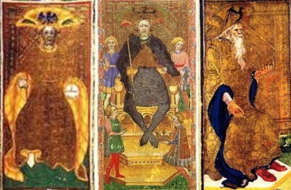
Adoration of the Magi among other things, died in 1427. Below I reproduce three emperors, first the BB, then the CY, and at right the PMB.
Between the BB and the CY, the BB looks to me the more primitive, as it seems to have for Tolfo. There are fewer details; the CY adds attendants, legs, throne, etc.
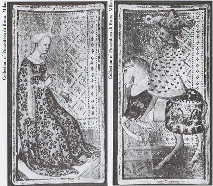
Here are other examples relating to what Tolfo is talking about. First, for Tolfo's comments about the Knights of Arrows and Cups, with the latter's clothing enlarged to make it easier to see the
colombina raggiata:
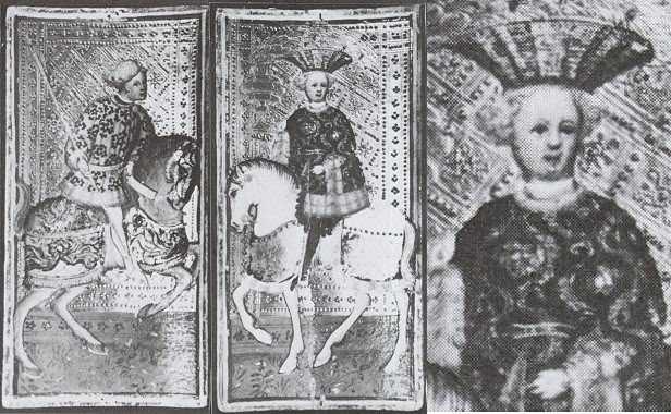
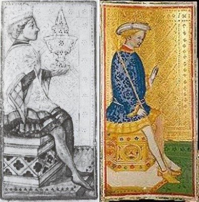
And also the Queen of Arrows and the Knight of Coins.
We see the lack of attention to arms in the Queen's left. On the Knight, we see his Pisanello-style hat and also his incongruous posture in the saddle, quite at variance to that of the rearing horse awkwardly crammed up against the border of the card. The knight's erect posture, as opposed to a more realistic one of him leaning forward, is also characteristic of Filippo Maria's 1436 ducats (or florino, as Kaplan calls them). His is at the upper left below, with Francesco Sforza's somewhat more natural 1450 version on the upper left. The ducat as it occurs on the BB suit of coins is on the lower left, and that of the CY on the lower right.
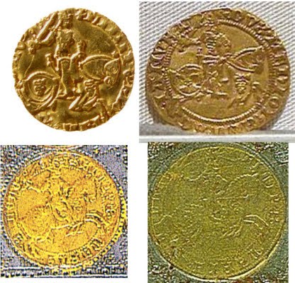
When Tolfo says that the BB looks older than the CY, but couldn't be, because of the ducats, she says that because for some reason she thinks that the BB but not the CY reflects Filippo's 1436 "rearing horse" ducat. She needn't have been concerned on that point (although her 1428 dating of the CY definitely should have been a concern): the design of the coins in both decks is virtually the same, and neither is precisely like that of Filippo's ducats.
Perhaps Pisanello had a hand in the improved ducats we see in the BB and CY, from his 1440-1441 medal-making in Milan. The coins on the cards are obviously not imprints of real coins; if they were, they would be reversed images. They are not even facsimiles (Kaplan's word). I speculate that the dyes for the BB coins, done with Pisanello's innovative techniques, were made to order and still in the Bembo shop when the CY was made. Thus both the BB and the CY are likely post-1440, the time Pisanello brought his techniques for making medals to Milan (my source for Pisanello is the Wikipedia article on him).
Regarding actual styles of dress in Northern Italy in the 1440's, I need to look at more art. Unfortunately it was not a particularly prolific period, at least not in sources I have consulted. I cannot even find images of the Borromeo frescoes, other than the one of the people playing cards. And even if I did, I wouldn't know when they were painted. C. 1440 is the usual dating, but that may just be because Pisanello was in Milan then. Pisanello himself has work in that style from the time of the 1432 drawing at least (if not, as for Armstrong, from before 1420). At this point all I have for certain is the imagery I posted earlier, principally the sequence at Monza.
One comment that Tolfo makes that I would like to know more about is that the capes of the BB are closed at the sleeves, unlike the CY. Does this reflect any actual change in fashion, and if so, which came first? I would guess that being closed at the sleeves is later, since it requires more tailoring; so it is another example of the BB's paying less attention to being anachronistic, while still being of an earlier overall style than the CY.