Re: How eccentric is the Sola-Busca?
Posted: 05 Feb 2015, 10:56
Phaeded wrote
Hercules is not a bad reading of the middle putto. But Hercules was the type of Christ, and so of the rubedo. The Liber Mutus even showed the last stage of the work as the apotheosis of Hercules (http://www.esoblogs.net/wp-content/gall ... utus15.gif), your "heroic overcoming of the self towards a cosmological understanding". Apotheosis of Hercules, or a burlesque of that motif, seems to me a good enough reading of the Ace of Staves. A precedent is the putti that play with the armor in Zoppo's Venus Victrix drawing
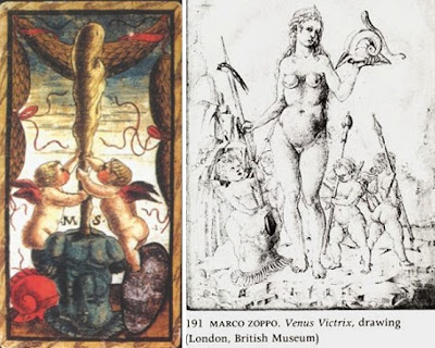
I have written on this subject, even bringing up Hercules (a cuirass drawing in the Hypnerotomachia), at viewtopic.php?f=12&t=530&p=8743&hilit=Venus+Zoppo#p8743. The Zoppo armor would appear to be Mars', since it is Venus, but that does not have to be true for the card.
Phaeded wrote,
I see your point about the lack of a blue band on the two aces, that it looks like gold, and the background is indeterminate. I do not know the basis. It would be odd and unprofessional for her to just make it up because it fits her proposal. Art historians, even ones with the actual cards at their disposal and the scientific equipment to analyze the pigments and knowledge of how they change over time, are not exempt from bias. She should have explained her point with some evidence, since prima facie it seems contradicted by visual inspection. I notice that she refers us to her reproductions of the two cards. I wonder if they look different there. Unfortunately I have misplaced my copy of the book (since yesterday!).
Phaeded wrote, in response to Gnaccolini's comment "Sanudo is documented as commissioning work by Marco Zoppo, whose style is similar to that of the cards":
Phaeded wrote,
I of course do not see red, white and black on the three putti. The colors come from the humors. Melancholia is the black humor, white that of phlegm, red that of blood (the "sang" in sanguine). Your later quote about Ficino speaks of "phlegmatic sloth": the two words go together.I do not doubt that there are some alchemical associations, but imagining red, white and black colors onto the three putti is but an alchemical interpretation run amok – there are no differences between the three putti besides their physical dispositions. The dispositions are thus:
• Left putto: melancholic pose with head on hand
• Central Putto: Atlas/Hercules
• Right putto: arms crossed to indicate inaction (not even reading) = acedia/sloth.
Hercules is not a bad reading of the middle putto. But Hercules was the type of Christ, and so of the rubedo. The Liber Mutus even showed the last stage of the work as the apotheosis of Hercules (http://www.esoblogs.net/wp-content/gall ... utus15.gif), your "heroic overcoming of the self towards a cosmological understanding". Apotheosis of Hercules, or a burlesque of that motif, seems to me a good enough reading of the Ace of Staves. A precedent is the putti that play with the armor in Zoppo's Venus Victrix drawing
I have written on this subject, even bringing up Hercules (a cuirass drawing in the Hypnerotomachia), at viewtopic.php?f=12&t=530&p=8743&hilit=Venus+Zoppo#p8743. The Zoppo armor would appear to be Mars', since it is Venus, but that does not have to be true for the card.
Phaeded wrote,
That is quite a summary! As far as I can tell, the four humors only correspond to the four suits in the court cards. But perhaps that is enough. But how do the trumps demonstrate the positive and negative outcomes of the material of elements/humors? I'm not saying you're wrong, just that I'd like to hear more. If you already did, just point me to it. I've been away from this subject and focused on other things.So we have the materia of the tree, cypress or otherwise, transformed into a useful tool in the next suit, staves - a notion of positive progression through the pips. The motto on the ace of coins is to “persevere”, which in the pips is through the four elements/humors, and then classical and biblical exempli in the trumps, the latter demonstrating positive and negative outcomes of the admixtures of the material of elements/humors.
I see your point about the lack of a blue band on the two aces, that it looks like gold, and the background is indeterminate. I do not know the basis. It would be odd and unprofessional for her to just make it up because it fits her proposal. Art historians, even ones with the actual cards at their disposal and the scientific equipment to analyze the pigments and knowledge of how they change over time, are not exempt from bias. She should have explained her point with some evidence, since prima facie it seems contradicted by visual inspection. I notice that she refers us to her reproductions of the two cards. I wonder if they look different there. Unfortunately I have misplaced my copy of the book (since yesterday!).
Phaeded wrote, in response to Gnaccolini's comment "Sanudo is documented as commissioning work by Marco Zoppo, whose style is similar to that of the cards":
It is not irrelevant. The cards are in a style similar to Zoppo's. Sanudo liked that style. Apparently Nicola was able to draw or engrave in that style. So the style supports (without proving) the thesis that they were for Sanudo.Now that we know the artist was likely to have been Nicola di Maestro Antonio d'Ancona this last point is irrelevant.
Phaeded wrote,
Why not? It's his mother's family. The Venier stemma makes sense to be there, because that family isn't the one that starts with "S". That way both families, Sanudo and Venier, can be represented on those cards.But what bothers me the most about this Sanudo proposal is that of the 8 cards showing a stemma why place his initials on two of the cards (sword and baton aces) that clearly show the Venier’s coat of arms?